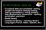
For example...

This map reflects global youth literacy. According to the website:
Most of the young people living in most territories can read and write. Only five territories have lower than 50% youth literacy rates. Four of these five are in Northern Africa. Japan recorded the highest rate of youth literacy for a single territory.The highest number of literate youth live in Eastern Asia, where the youth literacy rate is 98.9%. Of the 12 regions, 8 have youth literacy rates of over 95%.

This map shows global adult literacy. World Mapper reports:
The percentage of literate adults is lower than that of literate youth in every region of the world. The biggest differences are 17% in Northern Africa, 13% in Central Africa, and 11% in Southeastern Africa. The smallest difference between youth and adult literacy rates is 1% in Japan.The largest populations of literate adults live in China, India and the United States. India has a literacy rate of 61%, the other two territories have rates of 91%.
These maps just scratch the surface. There are so many other variables that you have students investigate and the map will stretch and distort accordingly. The obvious benefactors are students in taking geography - especially World Issues. This is quite a nifty tool to get some really interesting critical literacy discussions happening. These maps are great visuals that can be used to talk about the influence of power relations, gender, race, class and identity in relation to any number of the factors that can be mapped on this website. I love this!


No comments:
Post a Comment